

Charts, built straight from your table.
Bar, line & pie
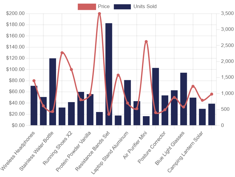
Pick the chart type that fits your data — columns for comparisons, lines for trends, slices for share. Combo charts mix bars and lines on one canvas.
Group & aggregate
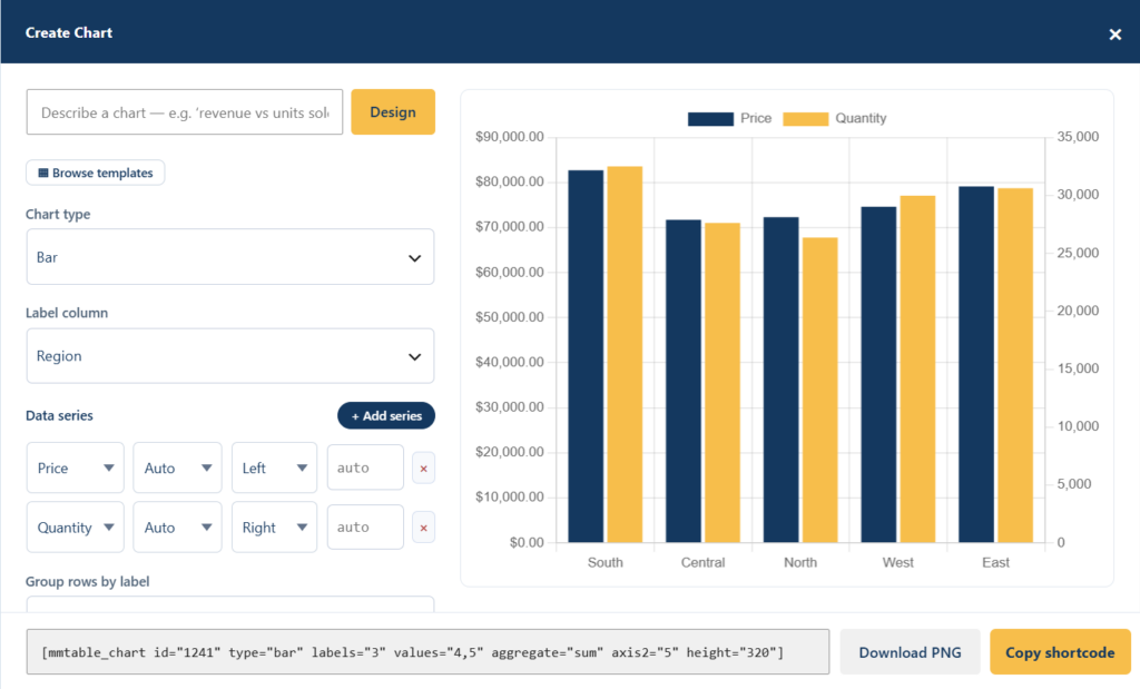
Group rows by a label column and sum, average, count, min, or max the rest — or plot each row as-is when it's already one point per row.
Dual axes & data labels
Put a small-scale metric on a secondary axis (e.g. units vs. revenue), and draw values on the chart for small datasets.
Your colors
Set bar, line, and slice colors to match your brand. Flat and clean — no gaudy defaults.
Stacked & part-to-whole
Turn on stacking for part-to-whole bar and area charts when you're showing composition over categories.
Embed anywhere
A chart is just a shortcode or block. Drop it into posts, pages, or your page builder alongside the table or on its own.
# Embed a chart built from table 42
[mmtable_chart id="42"]

# …or show the table and its chart together
[mmtable id="42"]
[mmtable_chart id="42"]
Try MMTable on your next site
Free version on WordPress.org. Pro from $69/year with a 30-day refund — no risk.